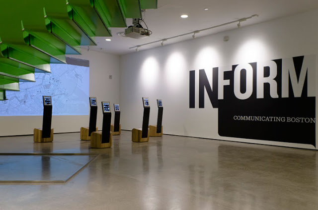
IN FORM
presents a legacy of projects in Boston over the past 50 years envisioned to increase access to the city. Three themes—Legible City, New/Public and Futures—explore how design can shape our understanding of the urban realm, expand its cultural sphere and propose new possibilities for its development. Combining architecture and urban planning with the design of information, exhibitions and events, each of these built and unbuilt projects embodies a particular vision of what Boston is and what it could be.
[from BSA website]
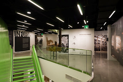
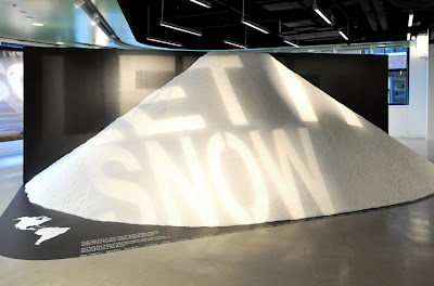
Thanks to the paragraph above, I have a sense of what this exhibit attempts to communicate. The new gallery is a dynamic space possessing a strong feeling of vibrancy and quality design, but I found the exhibition difficult to navigate with any sense of logic. I LOOK for organization and interpretive structure and I couldn't find it in this exhibition. The large graphic walls probably have a role in illuminating all this, but because they are so large and architectural (they define space, provide beauty and texture, AND carry the text) I found them hard to get close to.
Nestled on Boston's waterfront between the Fort Point Channel and the Rose Fitzgerald Kennedy Greenway, BSA Space opened in the Atlantic Wharf building in December 2011. Boston-based firm Howeler + Yoon Architecture designed the floorplan, using a concept that centers on a highly visible “cloud” ceiling and monumental stairs. These two architectural elements act as iconic markers for BSA Space and an invitation into the exhibits and meeting spaces above. The design was chosen during a 2011 design competition overseen by the BSA board of directors.


