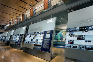
What are the pros and cons of organizing an entire history exhibition based on a chronology of events? In museum environments, where random circulation is likely and visitor behavior resembles serial clicking on the internet, what interpretive and design strategies can help visitors grasp, appreciate, and use chronology?
Please comment to this posting if you have thoughts about:
• What "handrails" can be used to assist visitors in grasping the circulation of chronologically organized exhibits?
• What floor plan schemes (linear, hub & spoke, theme chapters, etc.) have you encountered?
• Regarding exhibitions that escort visitors to the present day, what can a museum do so the exhibit remains contemporary? How will the ending not be out of date on opening day?
• At what point (length, square footage, stay-time?) is a chronological history exhibit just too much?
I've experienced a few interesting examples where exhibitions have afforded me the opportunity to dip in and out of chronology while exploring themes in a more random order according to my interests (the Minnesota History Center's
Weather Permitting
, and the Oakland Museum's
Gallery of California History
come to mind).
Regarding grand, chronological narratives, what successes and failures have you struggled with as an exhibit professional, solved as an interpretive planner or exhibit designer, and experienced as a visitor?
Please share your insight?
Thank you!

