The
Behind the Scenes
Galleries
at Boston's Museum of Fine Art provide visitors with a look at how the Museum and its curators collect, classify, and care for the works in the MFA's Art of the Americas collections, and how choices are made about what objects to put on view.
According the Museum's website, the
Behind the Scenes Galleries
represent "one component of the MFA’s multi-layered approach to the interpretation of art. They offer visitors a change of pace and a chance to consider the decisions and activities that lie behind what they see in the Museum. Each of the four galleries focuses on a specific theme."
The four galleries have intriguing and engaging themes: collecting, caring, classifying, and choosing. These words comprise the true activities of the museum that underpin exhibition and interpretation — nice "i-n-g" words for any museum to use to inspire investigation, experimentation, and creativity. What a great idea, I thought, for the MFA to foster active engagement between visitors and its collections.
However, I sense that certain objectives didn't crystallize with certain ideas.
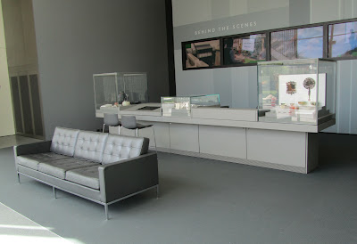
Even though I was seeking them out, I found these four galleries very hard to find. Even though their distinct ideas were supposedly integral to every one of the museum's displays, I found them impossible to grasp with any sense of relatedness or wholeness. Located on separate floors, behind dark partitions, and about 100 paces off of the displays, these galleries are very much behind the scenes, but they are so slickly and clinically designed they don't communicate any sense of an authentic behind-the-scenes encounter. They were not fun or energetic, like I know the workings of museums to be. I think the design of the galleries hindered their potential to inspire participation.
What were the goals here? Clearly, the MFA didn't want to interject technology or active interpretation into the formal galleries, yet they did wish to offer their marvelous collections under innovative and experimental interpretive light.
So conflicting goals have resulted in a series of oddly designed and apparently underutilized galleries. Their remote locations, inadequate size, drab design pallets, and slow-to-deliver technologies offered me little reward for having made the journey.


