MK/objectIDEA: Pat, here are some quick answers to your queries. Note that I’m first and foremost an exhibition planner, so these responses might be considered “What can the museum field teach us about timelines?”
PMK: What is the coolest/most effective timeline you've ever seen?
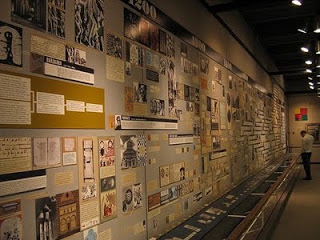
MK/objectIDEA: Honestly, they are few and far between. What comes to mind immediately is "The Crisis Hours" at the Sixth Floor Museum in Dallas, TX, located in the Texas School Book Depository: the site of Oswald's sniper perch. The timeline section of the museum examines the immediate aftermath of the assassination and the four-day period that culminated in John F. Kennedy's funeral and the murder of Oswald. I recall its effectiveness because of its compelling content, diversity of presentation (photos, objects, texts and an AV program), and above all: BREVITY. The chunks of time are tiny respective to other timelines I've seen. As a visitor, I could see the length of the timeline in one view and be comforted that my investment in the exhibit was only for a few minutes and didn't hinge solely on my reading lengthy texts. I lifted the following description from the museum's website. Notice the small bite-sized chunks of time:
Only 45 minutes after the shots rang out in Dealey Plaza, Dallas Police Officer J. D. Tippit was murdered in the Oak Cliff section of the city. Thirty-five minutes later, suspect Lee Harvey Oswald, a clerk at the Texas School Book Depository, was in police custody. Oswald was later charged with both murders. Less than 48 hours after the assassination, Oswald was murdered in the basement of Dallas Police Department headquarters by local nightclub operator Jack Ruby. Featured artifacts in this area include the handcuffs worn by Oswald during his attempted transfer from the city jail to the county jail. Along one wall, a detailed timeline explains the sequence of events as they unfolded in Dallas and in Washington, D.C. In a nearby theater, visitors may watch a 10-minute video featuring footage from the Kennedy funeral and scenes highlighting the global response to the assassination.
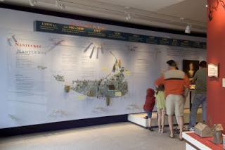
I recently had the great joy of working with the Nantucket Historical Association on the development of their new museum center. It's a trio of museums, actually—a whaling museum, historic candle manufactory, and changing temporary exhibition gallery. The museum center is unified with an “entrée” exhibition that features a timeline of island events that shaped the course of Nantucket history. I worked with the designers to ensure that the overhead band of dates and events was supported with rich displays of objects. The beginning of the timeline (shown here) features the earliest known human history of the
island and features a map of Nantucket with paleo-Indian objects placed upon it in the locations where they were uncovered by achaeologists. Visitors engage the display as a sequence of events; a chronological display of artifacts; and an orientation to the museum. I wouldn’t term it an all-inclusive timeline. It was very targeted at the island's defining moments.
PMK: What do the "bad/ineffective" timelines do wrong?
MK/objectIDEA: I have a few opinions about that:
A. The subject matter might not be solely linear (Information Breakdown). Surprisingly, designers sometimes try to force non-linear events into timeline formats. Case in point: In preparation for working with a large natural history museum, I recently surveyed exhibitions about the processes of evolution. I found that while scientists often express their interpretation of evolution visually, as an elaborately branching tree, many museums attempt to “tell the story” linearly as a sequence of events in a linear gallery. In cases like this (and I’d love to survey more) the dynamic nature of the subject is compromised by being forced into a timeline.

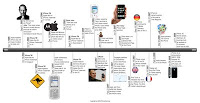
B. Many timelines have been created under the assumption that time is a valuable interpretive lens for a general audience. (Interpretive Breakdown). For example, you REALLY must love your iPhone to love the iPhone timeline no matter how beautiful its design might be. Museums often assume this level of interest and offer their guests deeply detailed timelines. Additionally, 2-dimensional timelines select their audiences rather stringently, I suspect. The ones containing objects are more compelling to me.
C. In an effort to be “rich” timelines become cluttered. (Design Breakdown). Case in point: filmmaker, Ken Burns created a timeline—The Civil War—presented through 11 hours of PBS airtime using images, music, maps, biographies, and historical documents. The film series is a rich document, and drew a wide and captivated audience. An example contrary to this is The Civil War in Four Minutes offered by the Abraham Lincoln Presidential Library in Springfield, IL. It’s also an audiovisual timeline. However, The Lincoln Library, in focusing on how the War played out on battlefield geography, used a single medium—a projected map—and the single interpretive lens—the landscape—to capture the library’s ambulating audience of tourist families and schoolchildren. Again, the provocative and informative title: The Civil War in Four Minutes signals the depth of the program and the time investment needed.
D. The designs of timelines do not often align with the intentions of their users. (Motivation Breakdown). In a museum setting, visitors come to be in a social place, to see the real evidences of history’s events, to be moved emotionally and intellectually, and to interact with objects and ideas. In a museum, visitors are in a “food-court” of experiences; continuously sensing the next offering and making choices for what to ingest. In this environment (akin to serial clicking on the Internet) timelines often unrealistically require their users to stop and pause for long periods of time and “grip the handrail” of a single experience.

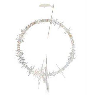
Exhibit audiences demand interactivity and choice. This example: http://thewhalehunt.org/whalehunt.html is an on-line timeline that would be at home in any museum. It takes the idea of a timeline and gives the user the ability to throttle the speed and manipulate the presentation artfully and intellectually.
PMK: Why is it so difficult to do timelines well? What are the unique challenges of presenting events over time?
MK/objectIDEA: By “well” I’m assuming you mean beyond graphic design. I’ve seen many attempts at timelines (in museums) that look beautiful but do not function informatively. And the more I think about it, this might be OK in some circumstances. The timeline that serves to ground the exhibition, Mathematica (designed by Charles and Ray Eames), is so multilayered that for many, it becomes beautiful wallpaper.

To sum it up—why some timelines are ineffective— I think designers sometimes collapse the ideas of events over time, unfolding sequence of events, and storyline. When all of these get rolled into something called a timeline, the communication integrity breaks down and graphic design attempts to compensate. Designers of all disciplines should work HARD with curators, historians and exhibition developers to distinguish the communication aim of the display. Perhaps a timeline isn’t the right medium.
PMK: What are some of the basic do's and don'ts of timeline design?
MK/objectIDEA: Do’s: brevity, poignancy, interactivity, flexibility, and sensuality. Don’ts: Complexity, prolixity, monotony.

